Marketing Makeover
Current business card and subsequent stationery has no logo as the company does not have one in use.
BEFORE
- Logo is typeface and does not represent the company
- Red line serves no purpose and does not line up with text
- Details look cluttered and unclear
- Too ‘wordy’
AFTER
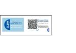
- Logo has now been created and approved to reflect the client’s needs
- P&D has been retained within the logo with the ampersand as requested by client
- Dark blue has been chosen as it represents a ‘corporate’ feel and blue is mostly associated with stability and reliability
- A paler blue has been added as the background as the client wanted a corporate look to the design but yet wanted to retain a ‘family, reliable and trustworthy’ feel and this colour compliments the darker one and gives it a softer edge
- Detail are organised and streamlined
- Addition of a QR code that contains all business details and can be stored in a customers mobile if required
- Both online and offline methods of contact details are displayed
- Addition of web address


